


Top Creative Tile Design Ideas for Home Makeover
Creative Tile Design Ideas for Your Home
Imagine walking into your bathroom and feeling like you've just stepped into a boutique hotel or a luxury spa for Home Makeover. That specific atmosphere of calm and sophistication rarely comes from having the most expensive faucets or the largest bathtub. Instead, interior designers know that the mood of a space is almost entirely set by the surfaces surrounding you, particularly the walls and floors.
Home Makeover
Many homeowners believe that achieving a high-end look requires a massive renovation budget, but that is often a misconception. Great style is the result of intentional decisions regarding shape, color, and layout rather than the price tag on the material. Whether you are searching for creative tile design ideas to refresh a small powder room or planning a complete overhaul, the secret lies in how you arrange the pieces you choose.
To simplify the selection process, we recommend starting with a "Visual-First" design approach. This method prioritizes the emotional impact---how you want the room to feel---before getting bogged down in technical specifications or installation chemistry. By focusing on the aesthetic outcome, you can transform a cold, sterile utility room into a warm, inviting sanctuary simply by swapping standard grid layouts for decorative tiles that add texture or depth.
Design psychology suggests that the lines and patterns on your walls dictate how your brain perceives the physical dimensions of a space. This concept of "room perception" explains why running rectangular tiles vertically can make a low ceiling feel higher, or why large-format tiles can make a cramped floor plan feel expansive. Your choice of modern kitchen backsplash patterns acts as more than just a splash guard; it is an architectural tool that actively reshapes the feel of your home.
You do not need a degree in architecture to master these principles. Moving past default "standard" looks allows you to find a style that feels personal and intentional. Turning your vision into a reality starts with the fundamentals of creative design.
Summary
This guide shows how tile choices—layout, scale, color, and texture—shape a room’s mood and perceived size more than material cost. It explores pattern strategies (grid, herringbone, chevron), small-bath expansion tricks, focal backsplash designs, and material selection, including porcelain vs. ceramic, PEI ratings, and moisture resistance. You’ll also find low-maintenance stone-look alternatives, artisan cement and recycled glass options, slip-resistant finishes and mosaics, grout color strategy (including epoxy), and techniques for seamless looks with large-format, rectified tiles and 3D accents. A final roadmap and checklist turn your vision into an actionable plan, from ordering overage to mapping layouts and coordinating with contractors.
Why Tile Layout Matters: Choosing Between Herringbone, Chevron, and Grid
You might spend hours picking the perfect shade of ceramic, but the way you arrange those pieces has just as much power to transform a room as the color itself. A simple rectangular subway tile can look traditional when stacked horizontally or surprisingly modern when turned vertically. It is the layout that dictates the energy of the space, deciding whether your room feels like a calm, orderly sanctuary or a dynamic, high-energy focal point.
While a standard grid pattern feels grounded and stable, diagonal layouts introduce movement that changes how you perceive the room's size. Patterns like herringbone and chevron create a "directional eye-line," effectively acting like arrows that guide your vision. If you have low ceilings, running these V-shapes up the wall draws the gaze upward, instantly making the room feel taller. Conversely, laying them horizontally across a floor pushes the walls outward visually, which can make a narrow hallway feel significantly wider.
The decision often impacts your budget. Herringbone uses standard rectangular tiles meeting at a 90-degree angle, which simply requires overlapping the ends. Chevron, however, requires tiles cut at a precise angle (mitered cuts) to create a continuous, sharp zigzag point. Because these diagonal patterns require cutting tiles to fit the straight edges of your room, you must purchase more material than usual. While a standard grid usually needs 10% extra for cuts and breakage, you should always budget for at least 15% waste calculation when working with these complex angles to ensure you don't run short.
Consider how these tile design ideas impact your project's difficulty and style:
- Grid (Stacked): Lowest cost and easiest DIY installation; creates a clean, static look perfect for minimizing visual clutter.
- Herringbone: Moderate difficulty using standard rectangular shapes; creates a classic woven texture that adds warmth without overwhelming the eye.
- Chevron: Higher cost due to specialized cuts and waste; delivers a sharp, modern geometric energy that acts as a statement piece.
Once you have mastered the flow of tile patterns, you can use them to solve specific spatial problems, particularly in smaller spaces.
How to Make a Small Bathroom Feel Twice as Large with Smart Tile Layouts
Small bathrooms often feel cramped not because of actual square footage, but because of "visual noise"---the busy grid created by hundreds of visible grout lines. Every dark line breaks up the surface, creating a cage-like effect that tells your brain exactly where the room ends. By switching to larger tiles, usually 12x24 inches or bigger, you significantly reduce those interruptions, allowing the eye to sweep across the floor or wall unobstructed to create an illusion of expansive open space.
Orientation is your secret weapon for further manipulating spatial perception. Just as vertical stripes on a shirt elongate the body, stacking rectangular tiles vertically on bathroom walls draws the gaze upward, instantly "lifting" a low ceiling. Conversely, running large tiles horizontally along the longest wall can push the boundaries outward, effectively widening a narrow powder room without moving a single stud.
Here are three proven strategies to maximize your square footage:
- Minimize Contrast: Match your grout color closely to your tile color to make the grid disappear and create a unified, fluid surface.
- Go Seamless: Use the same tile from the main floor into the shower (a curbless design) to remove the visual barrier of a shower curb.
- Scale Up: Explore specific small bathroom tile layouts for space optimization, or for the ultimate smooth look, consider a large format porcelain slab installation to eliminate shower grout lines entirely.
Applying these tile design ideas changes the psychology of the room, turning a claustrophobic utility space into an airy retreat.
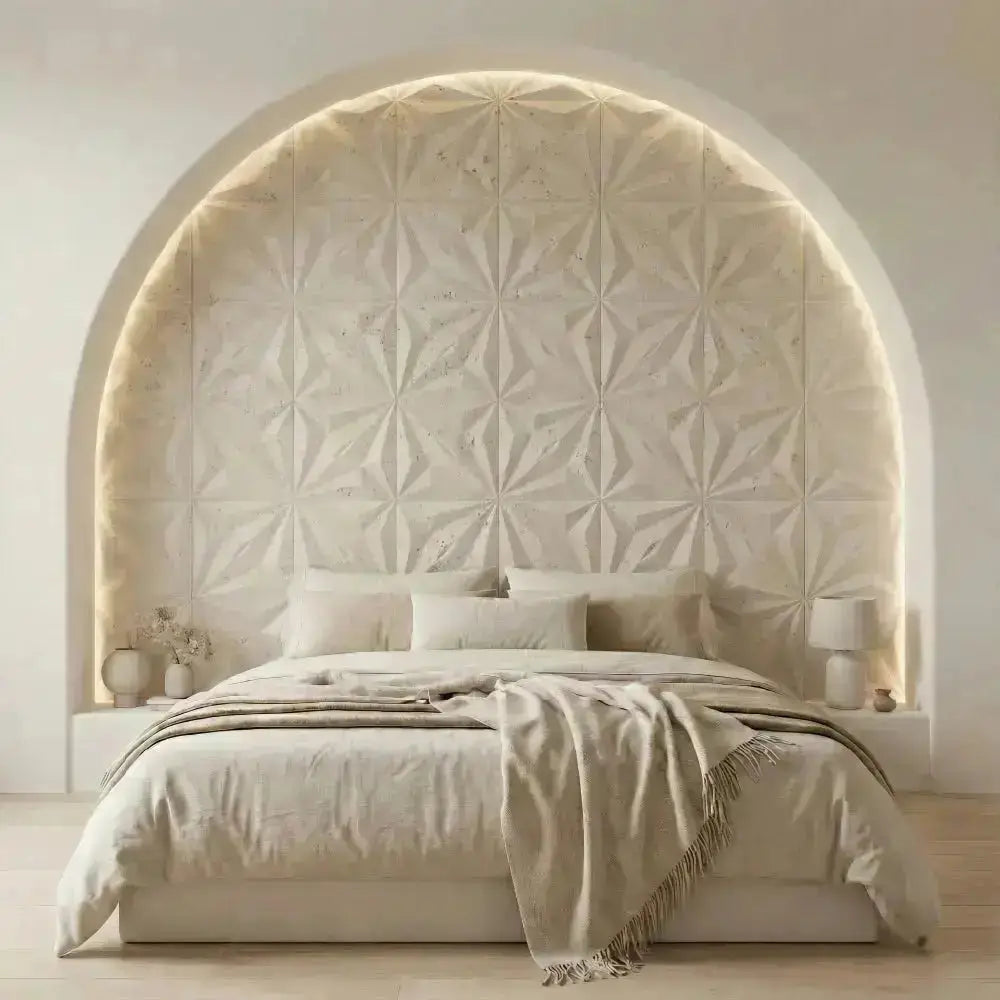
Modern Kitchen Backsplash Patterns That Elevate Your Cooking Space
Most kitchens naturally lack a visual center, leaving the eye to wander aimlessly across cabinets and appliances. Just as a fireplace anchors a living room, the space directly behind your range offers the ideal canvas for a dramatic "feature wall." By framing this area with a decorative border or using a more intricate tile arrangement than the rest of the backsplash, you create an intentional focal point that instantly organizes the room's design. This approach allows you to inject high-end style where it counts most without the expense of covering the entire wall in premium materials.
Rectangles have long been the default choice, but today's aesthetic often calls for more personality. Shifting toward geometric mid-century modern shapes---like hexagons, kites, or picket tiles---adds dynamic energy that complements the clean, straight lines of contemporary cabinetry. These shapes break the monotony of the traditional grid, introducing a playful rhythm that makes the walls feel active and sophisticated rather than purely utilitarian.
Visual balance is the secret to making these bold choices work harmoniously. If you select intricate modern kitchen backsplash patterns , it is wise to pair them with quiet, solid-colored countertops to prevent the space from feeling chaotic or competitive. For homeowners who want interest without overwhelming color, textured 3D wall tile accents offer a brilliant solution; they use actual relief and shadow to create depth, adding richness to a neutral palette while keeping the overall vibe calm and airy.
While the visual impact of your backsplash defines the kitchen's personality, the material you choose dictates how well it survives the inevitable spaghetti sauce splatters. A beautiful design is only as good as its ability to withstand heat and stains.
Porcelain vs. Ceramic: Selecting the Right Durability for Your Daily Life
Many homeowners use the terms "ceramic" and "porcelain" interchangeably, but knowing the difference is the key to a renovation that lasts. While both are made from fired clay, porcelain is fired at significantly higher temperatures, resulting in a material that is denser, harder, and virtually impervious to moisture. This fundamental difference in porcelain vs ceramic tile durability means that while ceramic is often more affordable and easier to cut for DIY wall projects, porcelain is the superior choice for floors that need to withstand dropping pots, heavy foot traffic, and the occasional spilled drink.
Consider what happens when a heavy object hits your floor. If a standard ceramic tile chips, you will often see the red or brown clay body underneath the glaze, making the damage obvious. In contrast, many porcelain options feature "through-body" color, meaning the hue runs through the entire thickness of the tile. If a chip occurs, it remains nearly invisible because the material underneath matches the surface, keeping your floor looking pristine for decades.
You don't have to guess which material can handle your family's lifestyle. The Porcelain Enamel Institute (PEI) rating is usually printed on the box to help you identify the best tile for high traffic areas:
- PEI 1: No foot traffic. Wall use only.
- PEI 2: Light traffic. Best for guest bathrooms or bedrooms (slippers only).
- PEI 3: Moderate traffic. Suitable for most residential kitchens and living rooms.
- PEI 4-5: Heavy to Extra Heavy traffic. Ideal for entryways, busy mudrooms, or commercial spaces.
Moisture resistance is the final factor in your decision. Because porcelain absorbs less than 0.5% of water, it is one of the premier waterproof flooring options for wet rooms like steam showers or laundry areas. Ceramic, being more porous, is best reserved for dry areas or vertical surfaces where standing water isn't a threat.
The Secret to Low-Maintenance Luxury: Natural Stone Alternatives
Real marble bathrooms look breathtaking, but they often come with a strict set of house rules to prevent permanent staining. Because natural stone is porous---meaning it has microscopic holes that soak up liquids---a simple splash of red wine or acidic lemon juice can leave a lasting mark. This is where modern low maintenance natural stone alternativesshine, offering the exact aesthetic of Carrara marble or limestone without the anxiety of constant sealing and specialized cleaning.
Today's manufacturing technology has solved this dilemma through high-definition inkjet printing, which stamps realistic stone imagery directly onto dense porcelain bodies. This process creates tiles with random variation, capturing the unique veining and depth found in nature so effectively that it is often difficult to distinguish them from the real thing. Unlike quarried stone, however, these porcelain counterparts are non-porous, meaning they repel water and bacteria, making them ideal for messy kitchens and busy family bathrooms.
Beyond just the pattern, the texture you choose plays a massive role in both the look and safety of your space. A "polished" finish offers a high-gloss, mirror-like shine that reflects light to make rooms feel bigger, but it can be slippery when wet. In contrast, a "honed" finish provides a satin, matte look that offers better traction for shower floors. For the most seamless, realistic appearance, many homeowners opt for a large format porcelain slab installation, which minimizes the number of distracting grout lines and mimics the grandeur of solid stone blocks.
Once you have established a timeless, durable backdrop with stone-look materials, you might feel the urge to inject a pop of unique color or texture. This neutral foundation provides the perfect canvas to experiment with bolder elements.
Adding Character with Handcrafted Artisan Cement and Recycled Glass Tiles
While stone-look porcelain offers a quiet, reliable backdrop, sometimes a room needs a conversation starter. This is where handcrafted artisan cement tiles come into play. Unlike mass-produced ceramics that look identical box after box, these tiles are poured individually into molds, resulting in slight variations in color and thickness that add unmistakable warmth and depth to a design. The result is a "perfectly imperfect" look that feels custom-made rather than factory-set.
These thick, durable tiles are frequently used to create bold focal points. Historically, they were a staple in grand entryways, often featuring victorian era encaustic floor motifs---geometric patterns created by different colors of clay rather than a painted surface glaze. Because the pattern runs deep into the tile body, these floors can be polished down over decades of wear without losing their design, making them a smart investment for adding a sense of history to a modern renovation.
For a lighter, more contemporary aesthetic, look toward the translucent beauty of glass. The sustainable recycled glass tile benefits go beyond just being eco-friendly; these tiles often possess a unique, gem-like quality that captures and reflects light, making small spaces feel brighter and larger. Since glass is non-porous, it is incredibly stain-resistant, though it is best reserved for walls as it can be prone to scratching under heavy foot traffic.
To get the best impact without overwhelming your space or budget, consider using these specialty materials in targeted zones:
- Cement: Mudroom floors or kitchen islands for a durable statement.
- Encaustic: Powder room floors to create a dramatic "jewel-box" effect.
- Recycled Glass: Kitchen backsplashes or shower niches for maximum light reflection.
While these materials add undeniable beauty, functionality remains paramount, especially in family bathrooms.
Safe and Stylish: Choosing Slip-Resistant Textures for Wet Rooms
Designing a bathroom often starts with imagining a sleek, polished spa look, but practical safety needs to be the foundation of those choices. While glossy, large-format tiles look stunning on walls, they can turn into a skating rink when placed underfoot in a steamy shower. The goal is to find waterproof flooring options for wet rooms that maintain that high-end aesthetic without risking a fall every time you step out of the tub.
Manufacturers measure how slippery a surface is using a rating called the Coefficient of Friction (COF), but you don't need a physics degree to choose the right material. Simply put, you want a tile with a "matte," "honed," or "textured" finish for any area that gets wet. These surfaces have a microscopic roughness that grabs onto your foot even when water is present. Prioritizing these slip-resistant shower floor textures ensures that your beautiful design remains functional for kids, guests, and aging family members alike.
Another smart way to increase traction naturally is by adjusting the size of the tile itself. Using smaller tiles, such as penny rounds or hexagons, increases the number of grout lines on the floor. Think of these grout lines as tiny treads that provide extra grip for your feet. This high "grout-to-tile ratio" is why you often see mosaics on shower floors; they offer built-in safety that larger, smoother slabs can't match, making them the best tile for high traffic areas that also handle heavy moisture.
Once you have selected a textured tile or a smaller mosaic for safety, you will find yourself staring at a significant network of lines between your tiles. While these joints are essential for traction, they also play a massive visual role in the final character of your room.
Why Your Grout Color Is the Most Important Design Decision You'll Make
While those grout lines provide necessary traction in the shower, they double as powerful artistic tools in the rest of the home. Many homeowners obsess over the tile itself but treat the filler as an afterthought. However, choosing tile grout colors is the secret weapon professional designers use to completely transform the vibe of a room without changing the price tag.
Depending on the mood you want to create, the relationship between the tile and the grout changes everything, offering endless tile design ideas for your space. Consider these three distinct strategies:
- Monochromatic: Matching the grout color to the tile (e.g., white on white) blurs the edges, making the surface look seamless and helping small rooms feel more expansive.
- High Contrast: Pairing opposite colors (like dark charcoal grout with white subway tile) emphasizes the geometric pattern, drawing the eye to the shape of the layout.
- Neutral Framing: Using a soft gray or beige creates a subtle definition that highlights the individual tile's texture without overwhelming the eye.
Beyond aesthetics, the practical durability of the material matters, especially in messy areas like mudrooms or behind a stove. Traditional cement-based grout is porous and loves to absorb spills, which can quickly ruin your modern kitchen backsplash patterns. For these high-risk zones, consider upgrading to epoxy grout. Unlike standard mixtures, epoxy is highly resistant to water and stains, meaning that bright white line stays white even after spaghetti sauce splatters.
Sometimes, the best grout design choice is to show as little of it as possible. If you prefer a surface that looks like one continuous sheet of stone rather than a grid, you need to minimize the number of joints entirely.
Mastering the Seamless Look with Large Format Porcelain Slabs
Nothing disrupts a sleek, modern aesthetic like a grid of busy grout lines. Large format tiles---generally defined as having at least one edge longer than 15 inches---are changing the game by mimicking the continuous expanse of natural stone slabs at a fraction of the cost. By drastically reducing the number of visual breaks on your floor or wall, these oversized sheets offer refreshing tile design ideas that make even modest bathrooms feel airy, expensive, and intentionally curated.
Achieving that seamless "wallpaper" effect relies heavily on the type of edge the tile possesses. You should specifically look for "rectified" porcelain, which has been mechanically cut after firing to ensure every corner is a perfect 90-degree angle. Unlike the soft, pillowed edges of traditional ceramic, rectified edges allow tiles to sit incredibly close together, often permitting grout joints as thin as 1/16th of an inch. This precision is vital for executing modern kitchen backsplash patterns that look like solid marble rather than a tiled puzzle.
While the visual payoff is high, the margin for error during placement is incredibly slim. Because these massive tiles are heavy and rigid, they cannot bend to accommodate uneven subfloors, leading to "lippage"---an uneven finish where one edge of a tile sits higher than its neighbor, creating a tripping hazard. Consequently, a successful large format porcelain slab installation requires a perfectly leveled surface and often necessitates special leveling clips to keep the face dead flat while the adhesive cures.
Committing to large format slabs provides a calm, clean canvas that works beautifully as a quiet backdrop for daily life. However, once you have established this smooth foundation, you might crave a specific design element to add character and break up the visual silence.
Creating Focal Points with Textured 3D Wall Tile Accents
While large slabs provide a quiet backdrop, a room often needs a moment of drama to feel complete. Textured 3D wall tile accents solve this by projecting from the wall, catching light to create shifting shadows that evolve throughout the day. This dynamic effect works best in specific zones where you want to draw the eye immediately, such as a vanity wall or fireplace surround. Treating these decorative tiles like art rather than a standard wall covering elevates a space without requiring a complex renovation.
Selecting the right spot is critical for keeping that sculptural look pristine. Because the ridges and waves intrinsic to these tile design ideas can easily trap dust or kitchen grease, you should avoid installing them near stovetops or direct shower spray. Keeping intricate surfaces in low-mess areas ensures your design remains a stunning feature rather than a cleaning chore.
Your Tile Project Roadmap: From Design Vision to Contractor Reality
You started this journey looking for simple tile design ideas, but you now possess the insight to see how shape, texture, and layout transform a room. You understand that a floor isn't just a functional surface---it is a canvas that sets the tone for your entire home. The difference between a standard renovation and a stunning design often lies not in the budget, but in the confidence of your decisions.
As you move from dreaming to doing, practical preparation is your safety net. When ordering materials, always calculate for 15--20% "overage." This buffer accounts for cuts, breakages, and waste, saving you from the nightmare of running out of a specific dye lot mid-project. Furthermore, do not let the fear of fleeting trends paralyze you. If you select materials that serve your functional needs and patterns that bring you joy, your design will outlast the changing fads.
Communicating your vision to a contractor is the final, crucial step. Instead of vaguely describing a layout, provide your installer with a simple "design map" or sketch. Whether you are navigating a complex herringbone vs chevron installation guide or deciding how to choose tile grout colors to highlight a pattern, a visual diagram eliminates guesswork. It ensures the tiles on the wall match the picture in your head.
Use this final checklist to execute your project with precision:
- Measure and Buffer: Double-check square footage and add that critical 15% overage for cuts and repairs.
- Test Your Light: Tape physical samples in the room to see how morning and evening light alter the color.
- Map the Layout: Sketch the pattern orientation for your pro, marking exactly where the center line should start.
- Define the Grout: Finalize a grout color that either contrasts to pop the shape or matches to expand the space.
- Seal and Protect: Confirm if your natural stone or porous grout requires immediate sealing to prevent stains.
Designing with tile is about more than home improvement; it is about crafting a personal backdrop for your daily life. You now have the tools to make smart material choices and the vocabulary to lead the conversation with professionals. Trust your eye, stick to your plan, and enjoy the lasting impact of your new space.
Q&A
Question: What’s the real difference between herringbone and chevron, and how does it affect cost and difficulty? Short answer: Herringbone uses standard rectangular tiles meeting at 90-degree angles, so it’s a moderate-difficulty layout that relies on overlapping ends. Chevron requires precisely mitered cuts to form a continuous, sharp V, which raises labor complexity and waste. Because diagonal patterns need more cutting to meet straight room edges, plan at least 15% overage for herringbone or chevron versus about 10% for a simple grid. The payoff: herringbone brings a classic woven texture, while chevron delivers a crisp, modern statement.
Question: How can I make a small bathroom feel larger without moving any walls? Short answer: Reduce “visual noise” by scaling up tile size (12x24 inches or larger) to minimize grout lines, and match grout to tile to make the grid disappear. Use orientation strategically: stack tiles vertically to lift a low ceiling or run them horizontally along the longest wall to widen the room. For continuity, carry the same floor tile into a curbless shower to erase visual breaks; for the most seamless effect, consider large-format porcelain slabs to nearly eliminate shower grout lines.
Question: Should I choose porcelain or ceramic, and how do PEI ratings guide durability? Short answer: Porcelain is denser, harder, and absorbs less than 0.5% water, making it ideal for floors, high-traffic zones, and wet rooms. Ceramic is more budget-friendly and easier to cut—great for walls and dry areas. Many porcelains offer through-body color, so chips are less noticeable. Use the PEI rating to match durability to use: PEI 1 (walls), 2 (light traffic), 3 (most residential floors), and 4–5 (heavy to extra-heavy traffic like entryways or mudrooms).
Question: How should I choose grout color and type to support my design and maintenance goals? Short answer: Pick a strategy based on the mood you want: monochromatic grout to blur lines and expand space, high-contrast to spotlight the pattern, or a soft neutral to frame texture subtly. In mess-prone areas (backsplashes, mudrooms), upgrade from porous cement-based grout to epoxy, which resists water and stains so light colors stay cleaner—especially behind a stove.
Question: How do I keep wet areas safe without sacrificing style? Short answer: Prioritize traction: choose matte, honed, or textured finishes in any area that gets wet. Manufacturers rate slipperiness via COF, but the simple rule is to avoid glossy tiles underfoot in showers. Increase natural grip with small-format mosaics (like penny rounds or hexagons); the extra grout joints act like built-in treads, making shower floors safer while still looking polished.

Leave a comment
This site is protected by hCaptcha and the hCaptcha Privacy Policy and Terms of Service apply.